Visualising a future pandemic
Reuters published a five-part special report that dives deep into how human destruction of wild areas is amplifying pandemic risk from bats. For the project, data reporters worked with specialists to develop an epidemiological simulation using disease dynamics, population size and density, regional commuting patterns, and worldwide airline traffic to understand how a contagion spill from the Amazon might prove catastrophic—a scenario scientists say could easily happen.
I had the opportunity to design and develop this visualisation for the story.
Creative brief
To understand how a novel pathogen spilling out of the Amazon might spark the next pandemic, Reuters used an epidemiological model to simulate the spread of a virus even more contagious than COVID-19 – a scenario scientists say could easily happen. I was tasked with coming up with a visualisation that shows the phenomenon and its global impact using the narration of the hypothetical virus.
Understanding the data
The simulation, modelled by the data team using GleamViz – a simulator for epidemiological modelling, produced two simple datasets —
Seedings: a list of source and target cities that the virus spread to from day 0 to day 180.
Infections: cases estimated in every city and daily global totals.
If you are curious about how the data was generated by the simulation, you can read more about it here.
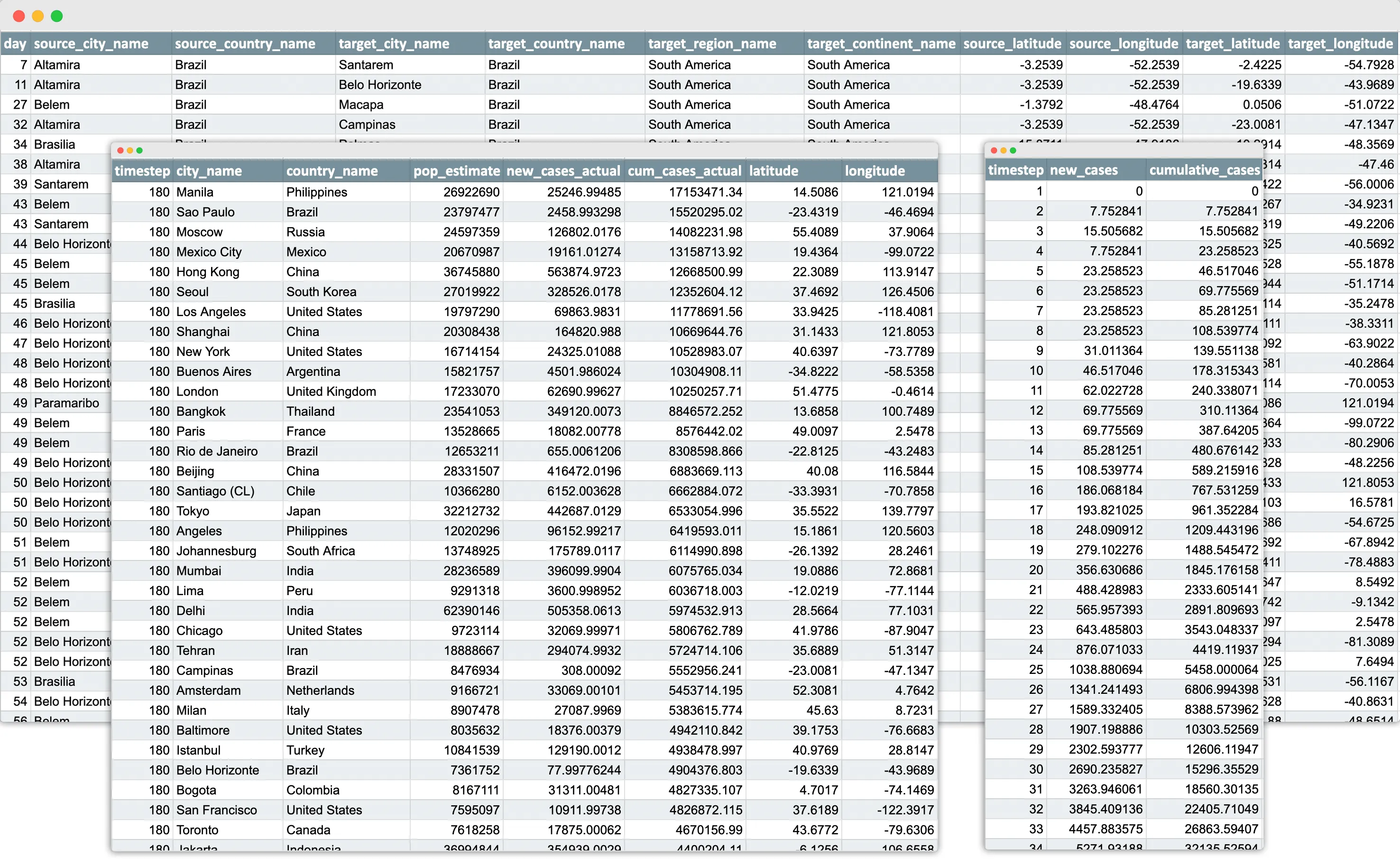
Since the data included geographic coordinates, my first response was to load it up in QGIS–a geospatial analysis tool– to see what the spread of the cities looked like. It was evident that there was quite an overlap of cities—the same city turned into a transmitter once it was infected with the virus.
What does the transmission look like?
I split the seedings into source and destination datasets and ran them through the hub-spoke algorithm in QGIS to generate virus “flight paths.” Animating those paths with the QGIS Temporal Controller tool gave me an overview of what was happening over a period of 180 days.
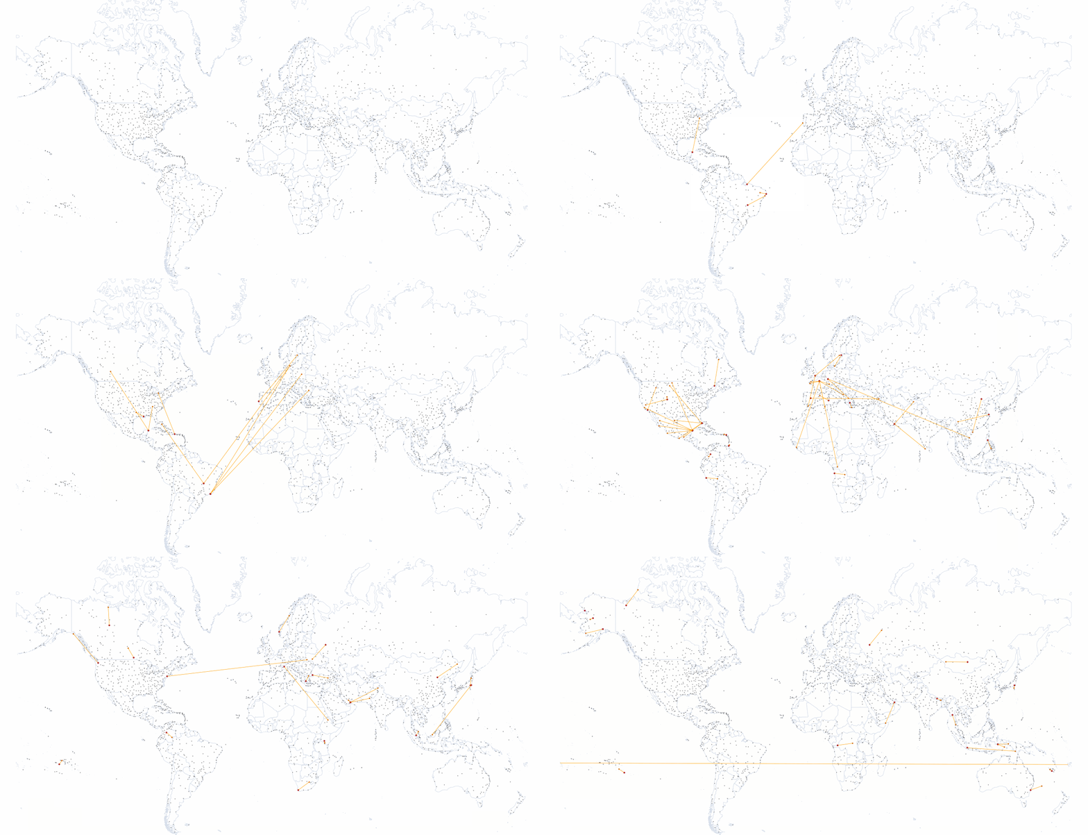
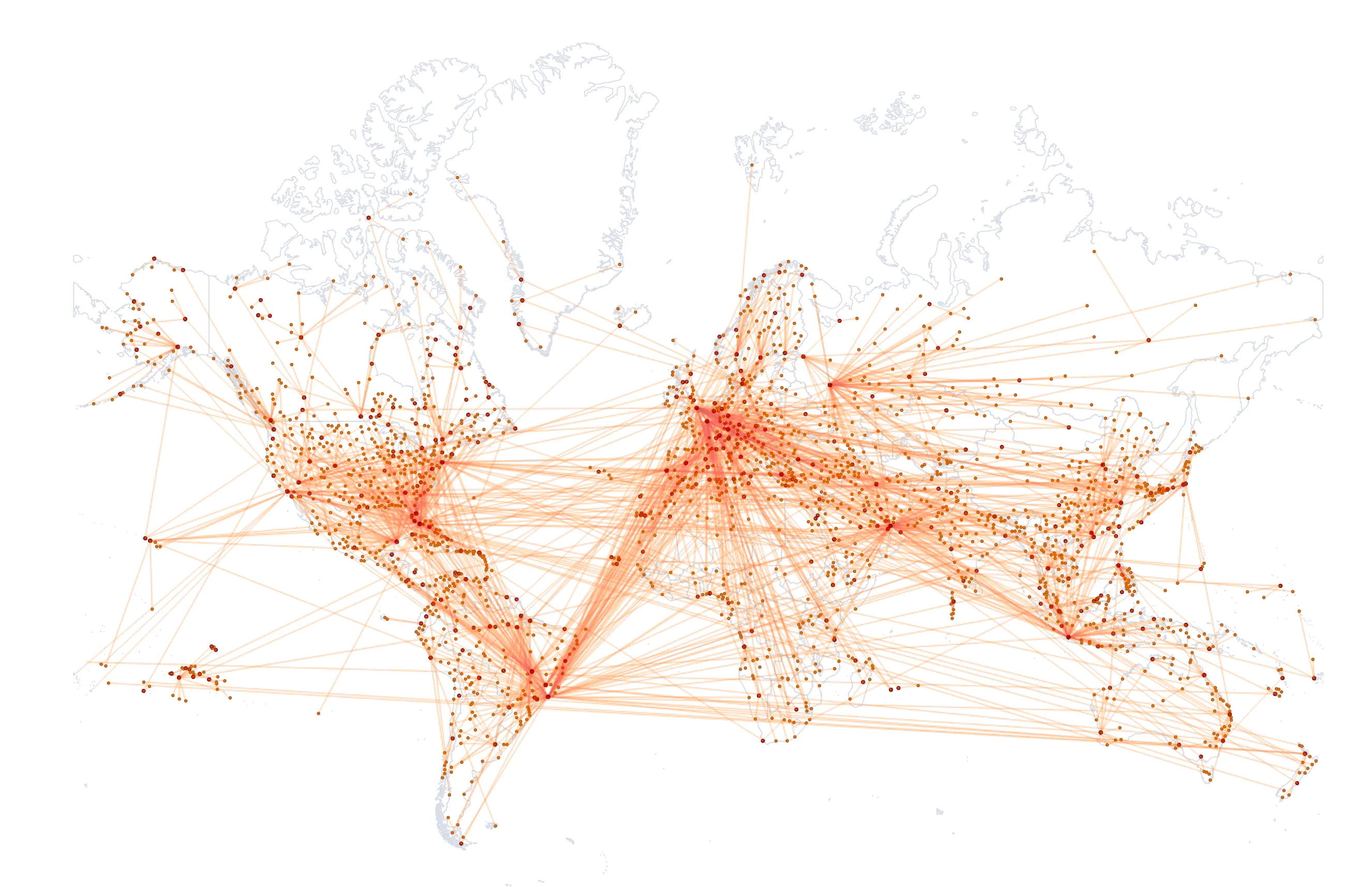
Now that I had an overview of the data, I wanted to delve into the numbers for insights into the dynamics of the hypothetical spread. I loaded it up in an Observable Notebook —my tool of choice for data analysis beyond Microsoft Excel. I can use javascript array functions or d3-array methods to quickly transform and understand the data and then visualise insights using the Plot library.
The result, shown below, was a connected dot plot that served as a timeline for the spread. Each dot represents a city, and is coloured by country. The y-axis is the time scale—the number of days since the original outbreak. (Note that the lower values on the y-axis are early days, so the only dots are in grey, the colour of Brazil.) The x-axis is the number ID assigned to the cities for easy mapping of source and targets.
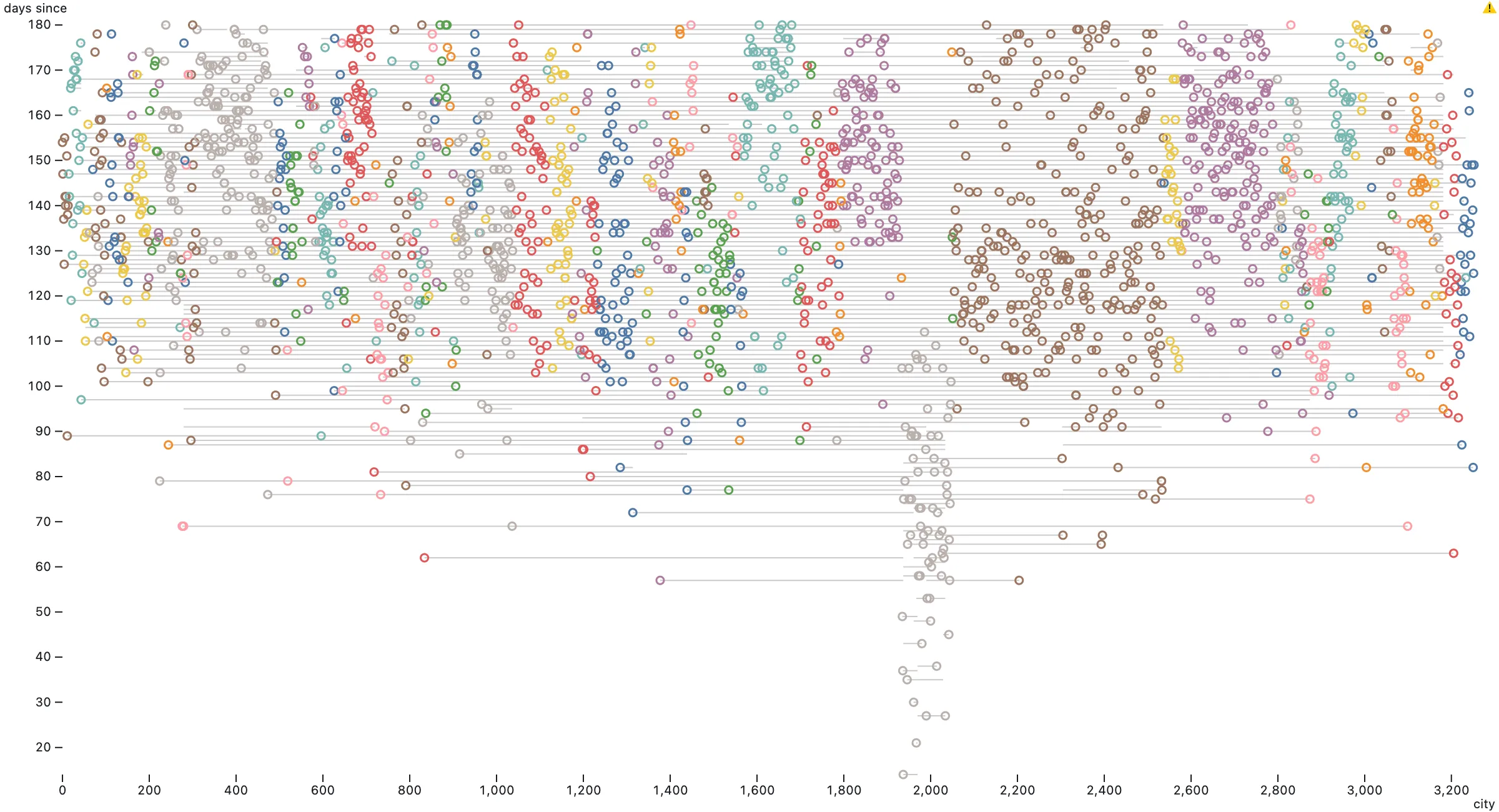
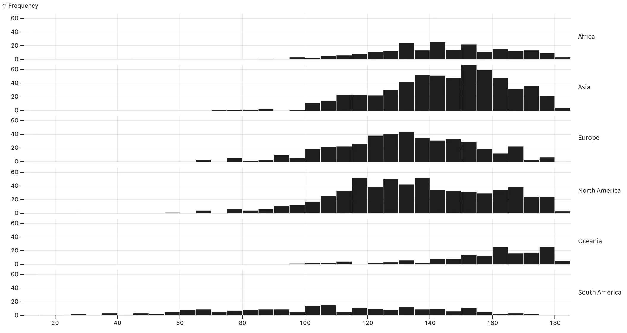
When do most seedings occur around the world?
The data showed that the outbreak starts in South America and spreads first to North America before moving to Europe, Asia, and Africa. Transmissions peak after about three months of circulation.
What do infection trends look like?
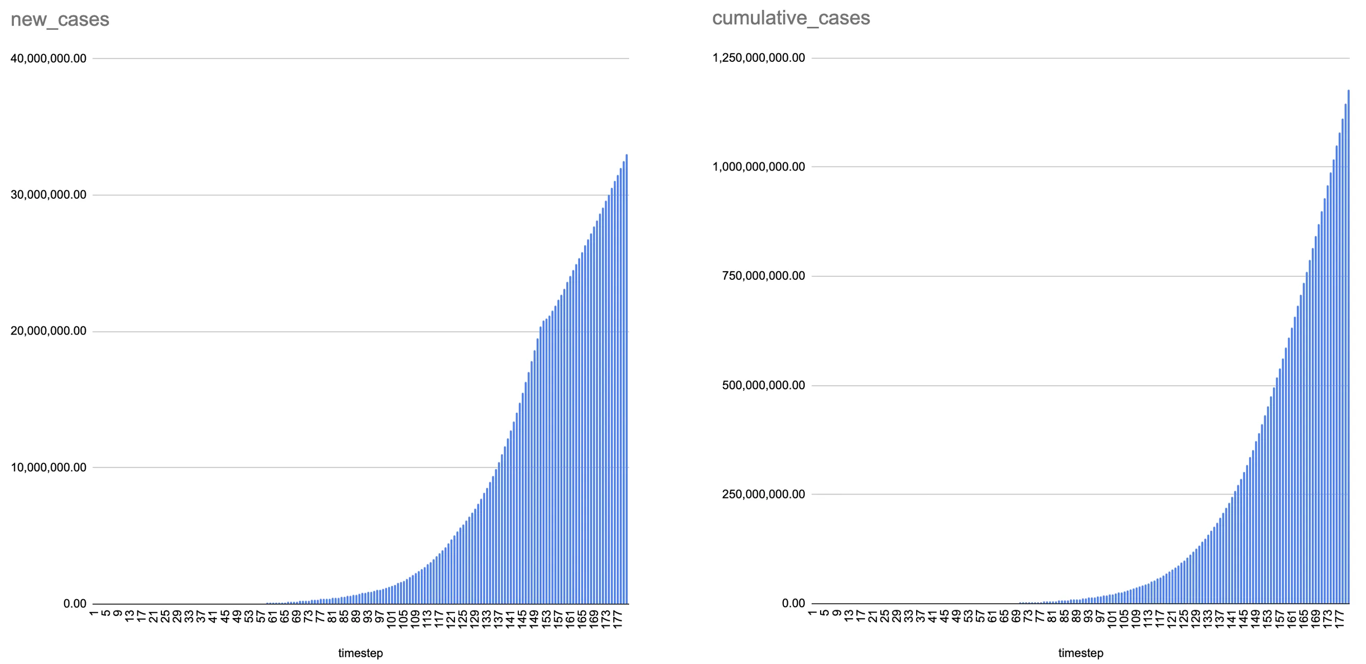
The spread of new cases follows an exponential trend as expected from a viral outbreak.
Ideating the narrative and the visuals
The primary aspect of the data was how the virus spreads over time and space. By focusing on these variables in the data, I drafted an outline, as follows:
- The virus started from Altamira, Brazil and got transmitted locally
- The virus broke free and moved to the US
- Eventually, it spread to Europe and Asia
- Cities emerged as viral hotspots
- Nearly the entire world is affected by the hypothetical pandemic
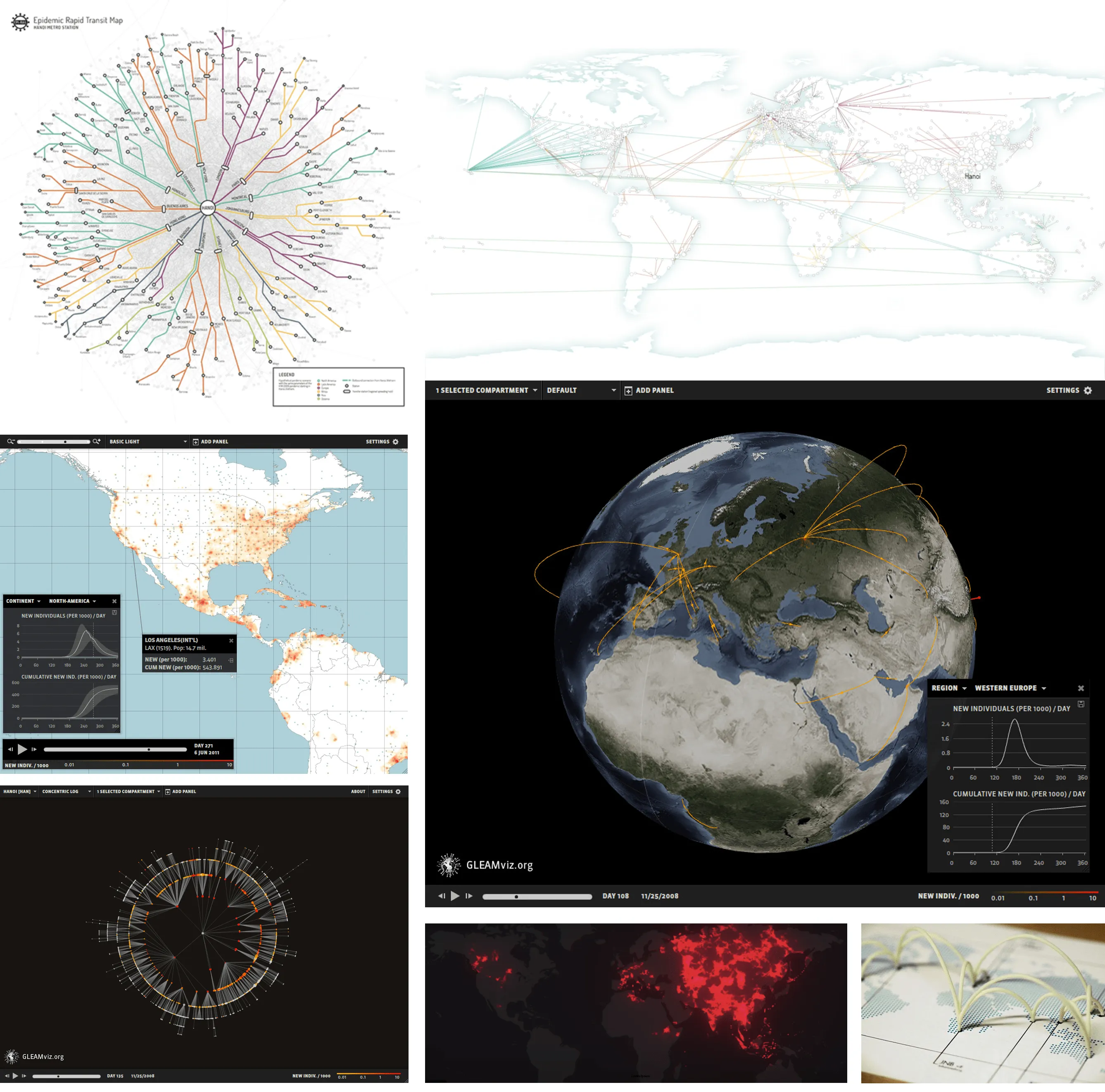
I looked at visualisations from Gleamviz and other sources for inspiration around epidemic visualisation. I found many geo-visualisations or network diagrams that show viral propagation.
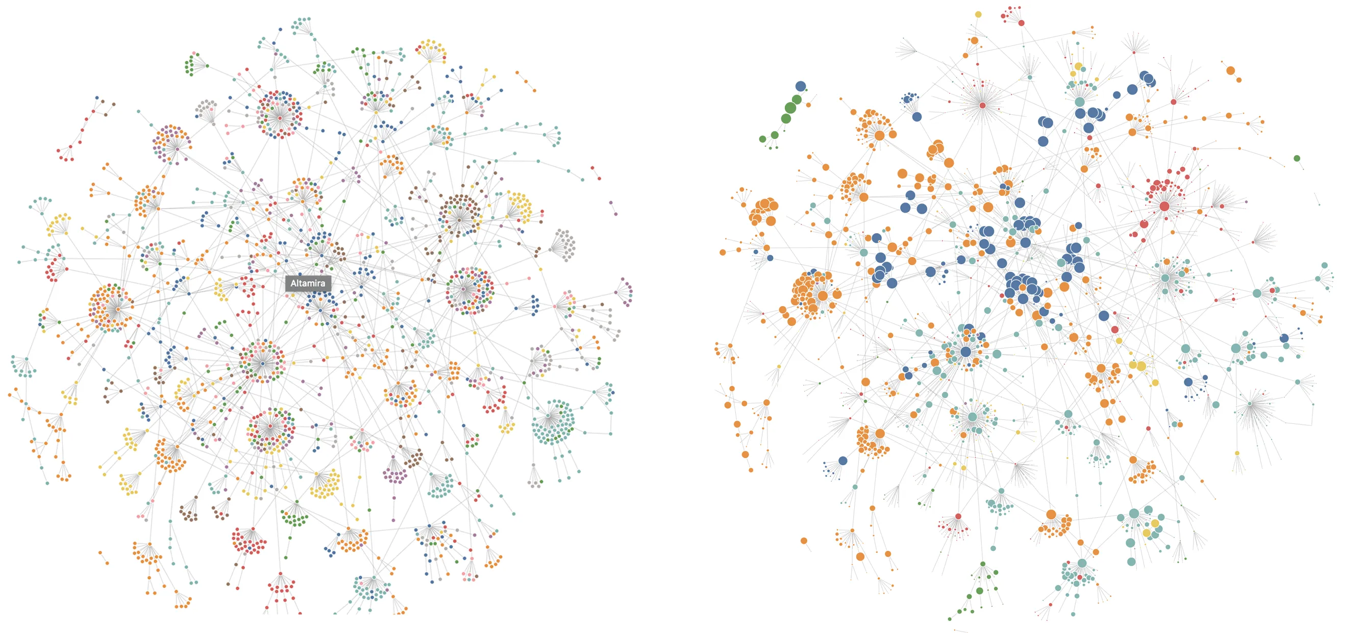
I plotted the seedings using a d3-graph on Observable. One thing this graph doesn’t show is geography, which makes it hard to demonstrate some of the points in the narrative. It looks good though, as it visually resonates with the form of a virus.
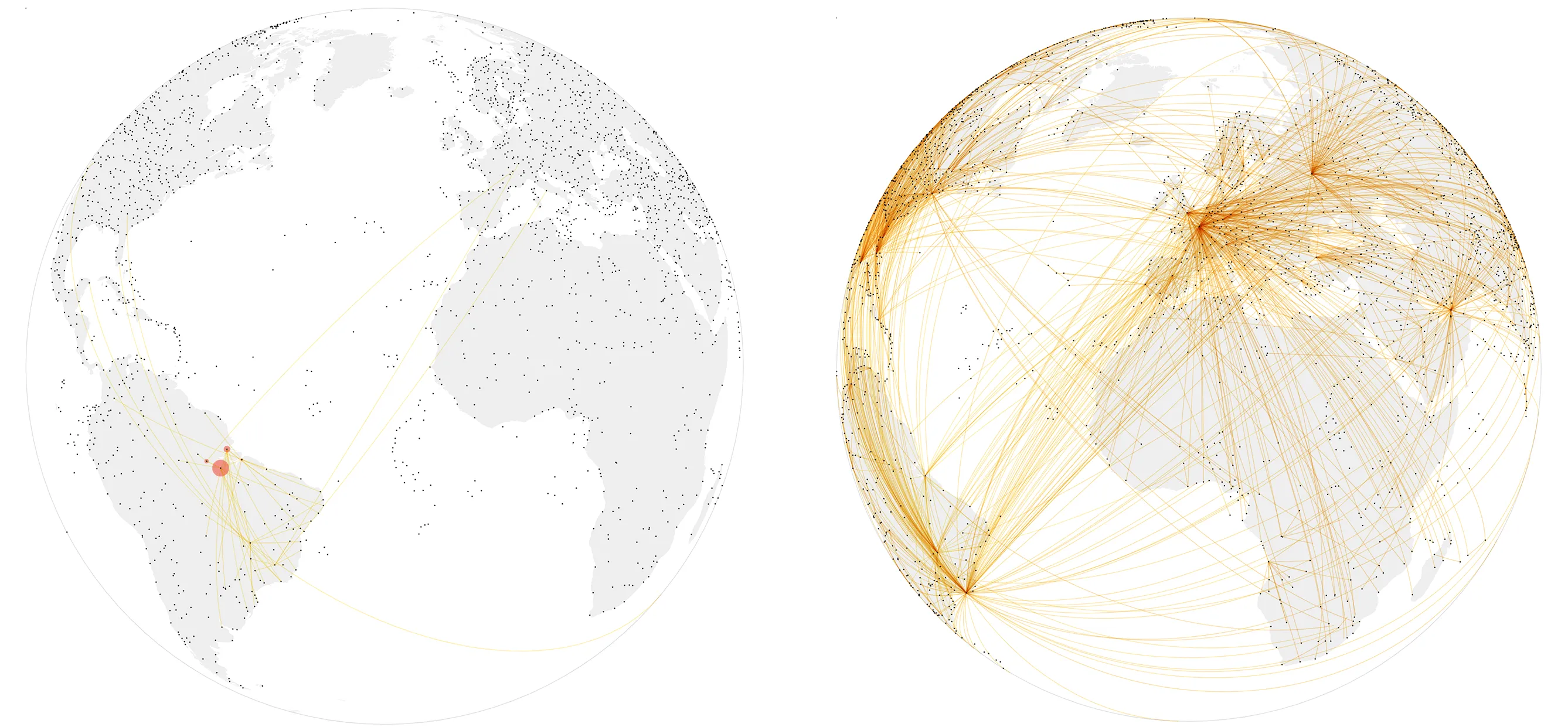
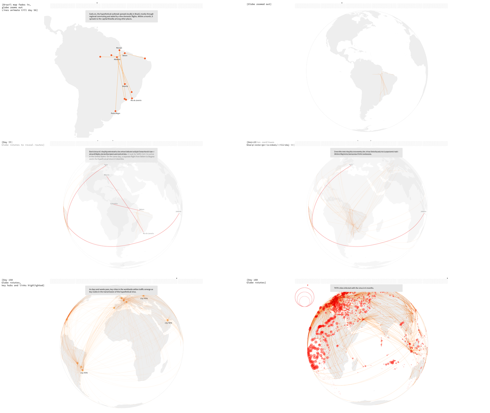
Placing the seedings on a globe solved the geography problem. A globe is a familiar form and carries a lot of impact for a story about something that touches the entire world, so I drew the infections as circles over the cities.
Building the globe visualisation
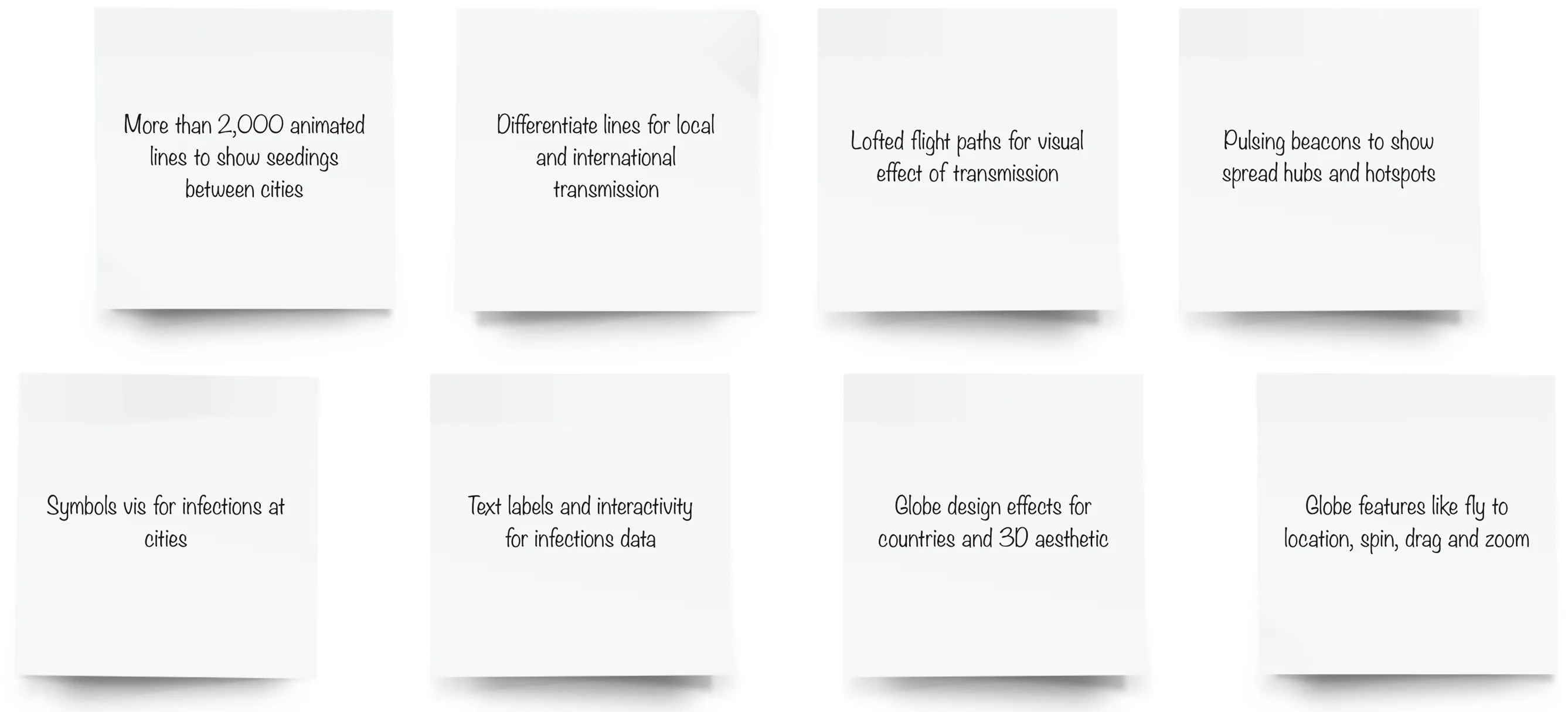
I built the chart as a standalone module that could be dropped into the story and driven by the narrative. It needed a long list of features.
A flat circle does not look like a globe, so I used layers of light and shadow gradients to give it depth and a 3D feel.
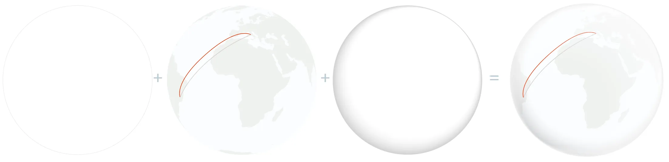
Rendering the 2,000+ animated lines on a canvas dropped the frame rate below 10 FPS. Instead of learning three.js from scratch, I moved the drawing to PIXI.js, a WebGL renderer, and kept d3 for the projections and the data. The chart became a stack of layers, each rendered on its own.
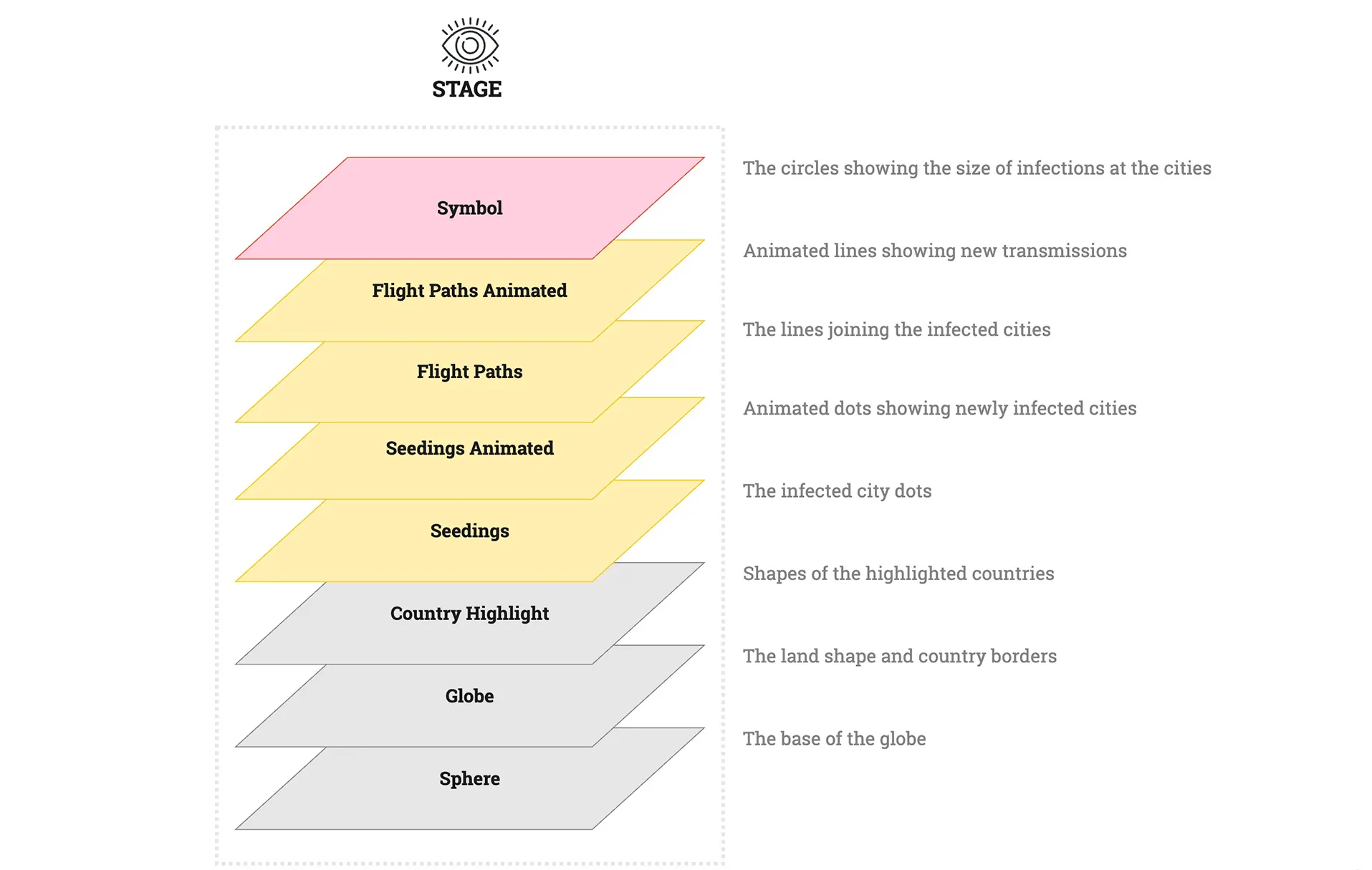
Designing for the story
The chart module could do a lot, but the story needed only some of it. As the art direction moved to dark mode, I settled on a grayscale palette with red as the single spot colour, and scaled back the exploratory features so the visualisation would serve the narration. The final piece is a scrollytelling experience built with Svelte and tuned to run smoothly on laptops.
Compelling stories can be told with familiar tools. A few well-chosen ones, QGIS, Observable, d3, PIXI.js and Svelte, were enough to take a spreadsheet of seedings to a globe that readers could scroll through.
The visualisation is part of Reuters’ five-part special report on how the destruction of wild areas amplifies pandemic risk from bats. This case study was first written up on Nightingale, the journal of the Data Visualization Society.
Researchers are racing to study the Amazon’s bats, the viruses…